The Yodenheim Project
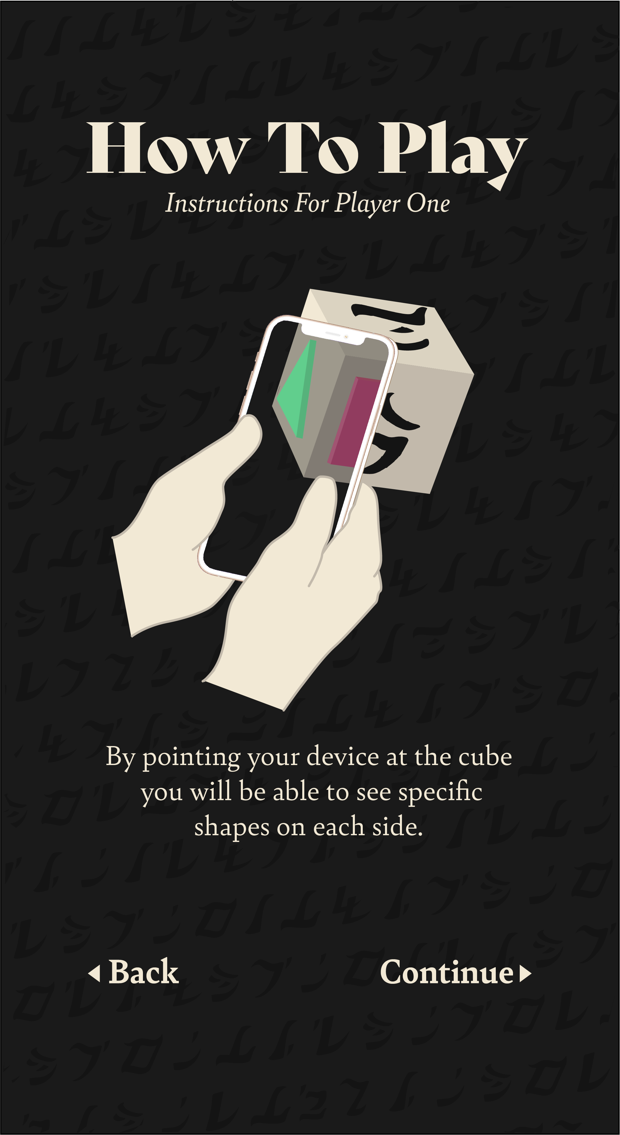
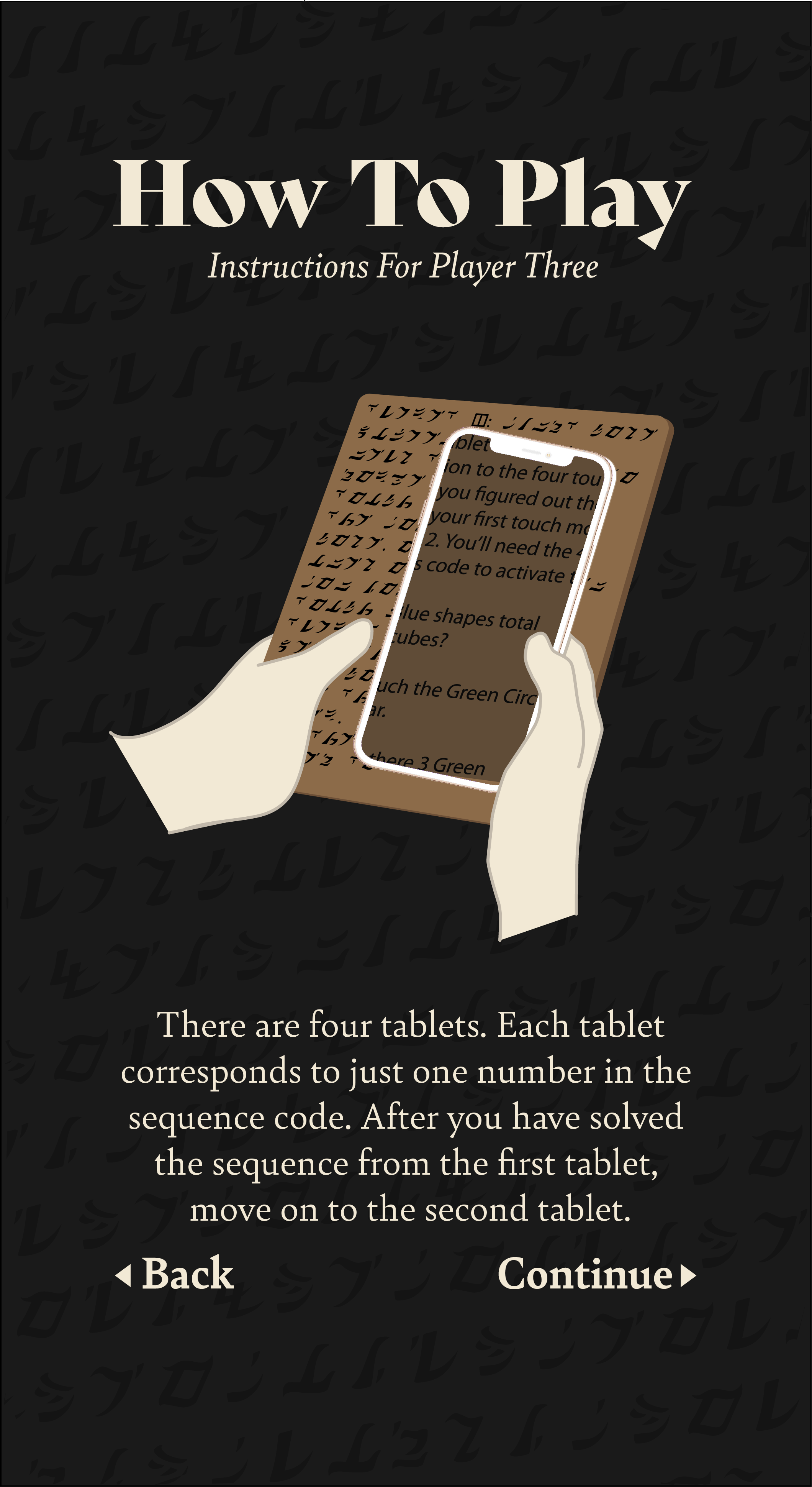
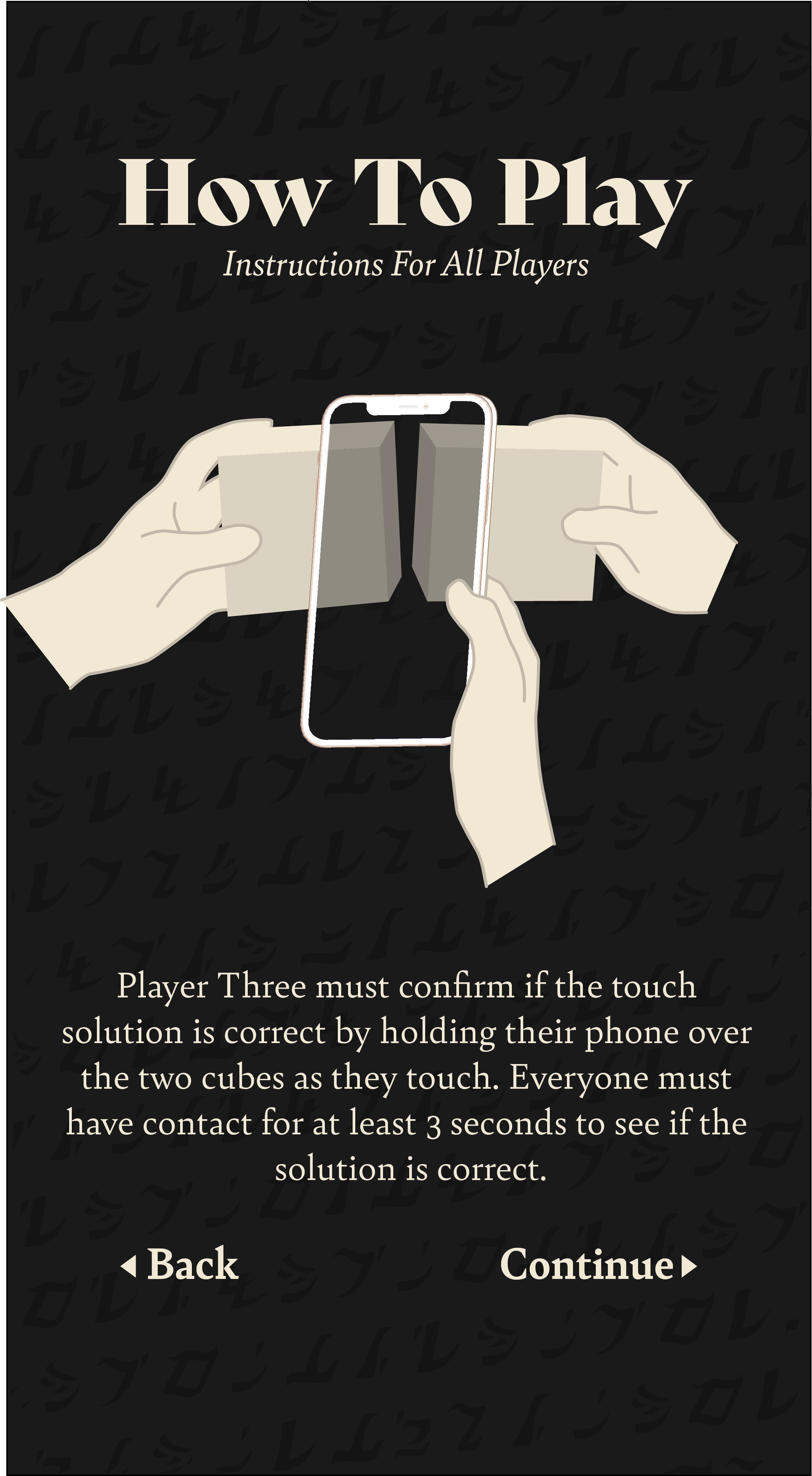
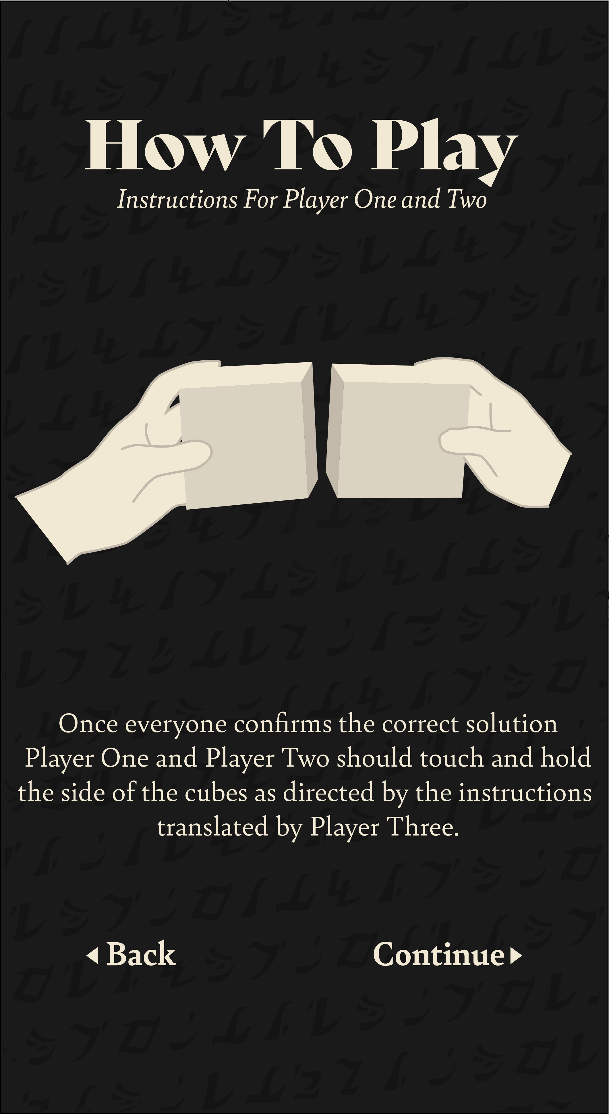
This was a group project where Juan, Raven, and I developed a functional AR game. The game is a three person multiplayer game that involves two cubes with strange markings and four paper tablets. The cubes and tablets can be deciphered with the players phones using a downloaded AR app. Once the game is installed players can translate the four paper tablets and can see shapes on their cubes. For this project I developed the runic font, created the tablet puzzle rule logic to make the game playable with four separate puzzles, created the lightning FX, and illustrated for the instructions pages. I also ran multiple playtests using the prototype game to gather feedback and continue improving the game. We developed this game in just 4 weeks.
Here is a video breakdown of the project
Here is footage from the playtest day at OSU
Designing the Font
I started with paper and pencil and drafted over ten versions of a unique alphabet. I started with designing the each letter based on the shape my mouth would make pronouncing the sound. As that style developed I included more of style of mark making from the reference font from Myst, D’ni, into my unique marks. Eventually I took my final sketches and vectorized them in Illustrator. I used Fontself to turn the individual letters into a functioning font and create an OTF and TTF file. Once the font was functional I typed a message onto a page and tested if the image would work as an AR target marker through Vuforia. The font worked beautifully and would easily be able to be a point where we could expand AR.
Designing the Font
This image shows a map of the design process for creating the Too Cubed Font.
Here is a close up of the final font created in Illustrator and made functional using Fontself, a plugin that allows you to create a functioning font. I decided to design this font in order to easily test multiple designs for our AR target markers. A good target marker has high contrast, so the font needed to have unique strokes with lots of space for bright and dark areas.
Puzzle Design
I was tasked with designing the tablets but I quickly realized that in order to design the style the content or puzzle game rule logic would need to be worked out in order to determine how they layout would work. I asked Willie to send me the layout of the puzzle cube 3D shapes as if it was on a this unfolded dice, like an unwrapped UV.
An Unfolded 3D dice
It is complicated to work with a 3D object. I realized 'unfolding’ the object would help with game design.
Our Layout
Willie filled in the unfolded layout with the layout of the shapes on our cube.
Cleaned up Layout
This layout was what I used to setup the flow chart for the game design process.
I created a quick layout in Photoshop that would allow me to place colors and notes quickly in Miro. I started out imagining how the rules would playout. The idea that each Tablet would solve for 1 number in the 4 number puzzle solution code seemed like the best way to organize questions and visualize different puzzles in the same place to determine if there was overlap or inaccuracies in questions that could apply to multiple puzzles.
Each Puzzle Layout (A, B, C, D) represent 4 unique puzzles designed around two cubes that could still work with the same line of questioning. When I first designed the puzzles the Layouts would switch after one number was solved, indicating to the players that that number was solved, but we decided to switch around the design so that one Puzzle layout stays the same each round. I do think the game would be more fun and challenging if the colors switched layouts each time a Tablet was figured out because you would need to look at the cube each time and couldn’t memorize the changes, but for now the Layout stays the same across each tablet.
I knew there would probably at the top of the tablet to move onto Tablet 2 because initial test players didn’t understand once a tablet led to a ‘touch’ solution then they should move on. Instead, a test group of players with Layout A puzzle read Tablet 1 and once the first question resulted in a yes the script reading player kept reading every question. Hopefully we can design a UI element in AR that indicates to move on to the second tablet after a solve. You will see that design adaptation based on feedback in the final tablet design that I show below.
Here is a screenshot of the logic flowchart maps I created in Miro. If you want to try designing a tablet for our game, look at the four layouts (A, B, C, D) and see if you can design questions that you could ask that would only work for one of the layouts.
Here you can see a layout of the puzzle solutions based on the question logic. This was added to the side of the flowcharts to help Willie program for the game.
For the playtest we drew on some sticky notes on our paper cubes to align with Layout A. You can give the playtest a try with just yourself or perferably three people. Player 1 cube player, player 2 cube player, and a player that reads the instructions. After a successful ‘touch’ write down the number written on the side of the shapes you were instructed to touch and then have the instruction reading player move on to the next tablet page. The answer for the playtest should be [4,3,1,2].
Illustrating the Instructions
Illustrating the Instructions
This video shows a time lapse of me drawing over our reference photos for the illustrations to the game instructions.


Designing the Tablets
The tablets for the game serve not only as an AR element but also as the puzzle logic that is used to play the game. I needed to design both the English and Runic Font for the tablets, as well as come up with a visual or instructional solution to let the players know which of the four tablets they should be using.
I spent a good chunk of time confirming the layout of the AR puzzle tablet instructions in English that would overlay on the instructions. I found a font that had similar spacing to the Too Cubed Runic font I designed, but I still had to manually kern every single word to line up with the words on the other side of the puzzle. I also changed some of the puzzle logic to have more challenging questions that will require the instruction reader to take their phone off of the object so they can see behind the AR to translate one of the questions. This simple game design quality helped our game reach the project goal of digital and physical. For example, the questions on the 3rd tablet have solutions that read “Touch the Green triangle to the [rune shape]” so that the player has to describe or share the shape of the rune with the cube player. The 4th tablet has solutions that read “Touch the Green Triangle to P.” The player will have to figure out that the runes actually have English counterparts. So they will have to remove their phone and look on the tangible tablet to find the rune shape that represents ‘P’.
The design solution for the tablet identification ended up being four dashed lines and a domino shape. On the players screens, after a proper touch solution is solved the players see the shape fill out and the top and bottom area feature the shapes that they touched between the two cubes. If you have the app on your phone you can actually play the game on a computer screen. If you are holding your phone up to the coded tablets it should reveal the English.
The first tablet as it appears on the print out. The player holds this tablet and uses their phone to view the English that you can see on the image to the left.
The first tablet English that appears when you use your phone as a decoding device.
Designing the Unity FX
I also dived into Unity for the first time on this project to help with the development of some visuals to help indicate that the players have selected the correct runes. I searched through a bunch of tutorials and organized them into a google documents sheet. I searched for a large number of tutorials on how to create lightning and electrical effects in Unity. Below I detail my troubleshooting process.
The first tutorial I followed when smoothly until 1:09. At that point in the tutorial the creator selected their camera and then selected a Post-Processing behavior. I did not have this feature on my Unity. I tried installing the Post-Processing package but discovered it is out of date for Unity 2020 and that layers are needed. Explored importing packages until I finally found the right tutorial that requires an empty object and a post processing layer for the camera.
As I was troubleshooting I knew I needed a Post-Processing Stack Setting up the Post-Processing Stack showed that I needed to add the component to the Camera, but when I typed ‘Post-Processing’ into my camera components nothing came up. Searching through forums to troubleshoot, this user found that Post-Processing is no longer needed beyond Unity 2018. The user said Unity needs to update their manual and that this tutorial explains how to include the post-processing in the layer and volume controls.
This troubleshooting was a little frustrating but it actually answered a question I ran into last semester with ‘How can I improve the visuals of lighting quality in Unity’ and now I have stumbled into the solution for last semesters question in an only tangentially related making experience.
I also had to search how to add Packages into Unity again because it has been a while since I used Unity. I attempted several other tutorials for the FX effect. Finally, after 4 different tutorials and lots of trouble shooting I have 2 options for effects. I would like to expand on the visuals for what we have so far but I’m happy there is at least something function and I learned more about Unity.


